Chapter 23 Coordinate
本章節談論的是視覺化圖表的座標軸,本章節所涵蓋的概念可參考Claus O. Wilke所著之Fundamentals of Data Visualization的Chap3 Coordination & Axis與Chapter 8 Visualizing distributions: Empirical cumulative distribution functions and q-q plots。
23.1 NYT: Population Growth
紐時這篇報導「When Did the Anthropocene Start? Scientists Closer to Saying When. - The New York Times (nytimes.com)」討論了人類活動對地球所產生的深遠影響,並探討人類是否已經進入了一個新的地質時期,被稱為「人新世」。報導指出,人類的經濟活動、能源消耗和人口增長是人新世的主要因素,並且這些因素已經在地球上留下了不可磨滅的痕跡。報導也提到,地質學家已經發現了人新世的證據,包括核爆炸中的鈽同位素、肥料中的氮和發電廠的灰燼等。然而,報導也問道,人新世是否真的已經開始,以及它的開始點是否應該是農業革命、工業革命、核彈(77年前)或其他發展。

23.1.1 Parsing table from pdf
至R4CSS/data可以下載到本範例所用的資料(是一個pdf檔案)https://github.com/p4css/R4CSS/raw/master/data/world_population_change.pdf。
我們可使用tabulizer這個套件來萃取PDF文件中的表格,官方雖然提供cran可以直接安裝,但有可能會遇到R的版本不符要求而安裝不起來的情形。此時可用第二種方法,直接從github上安裝該套件。
程式碼使用 extract_tables() 函數從指定的PDF文件中提取表格數據,並將其存儲在 tables 變量中。在這個函數中,我們指定了要從第1頁中提取表格數據。
# Method 1
# install.packages("tabulizer")

# Method 2
# if (!require("remotes")) {
#     install.packages("remotes")
# }
# remotes::install_github(c("ropensci/tabulizerjars", "ropensci/tabulizer"))

library(tidyverse)
library(tabulizer)
# Extract the table

tables <- extract_tables('data/world_population_change.pdf', pages = 1)

# Extract the first element of the variable
raw <- as.data.frame(tables[[1]])

population_by_year <- raw %>%
   select(1, 2) %>%
   slice(-c(1:4)) %>%
   rename(years_to_2020 = V1, population = V2)
   # select(years_to_2020 = v1, population = v2)
   # mutate(years_to_2020 = v1, population = v2)
23.1.2 X and Y with log-scale
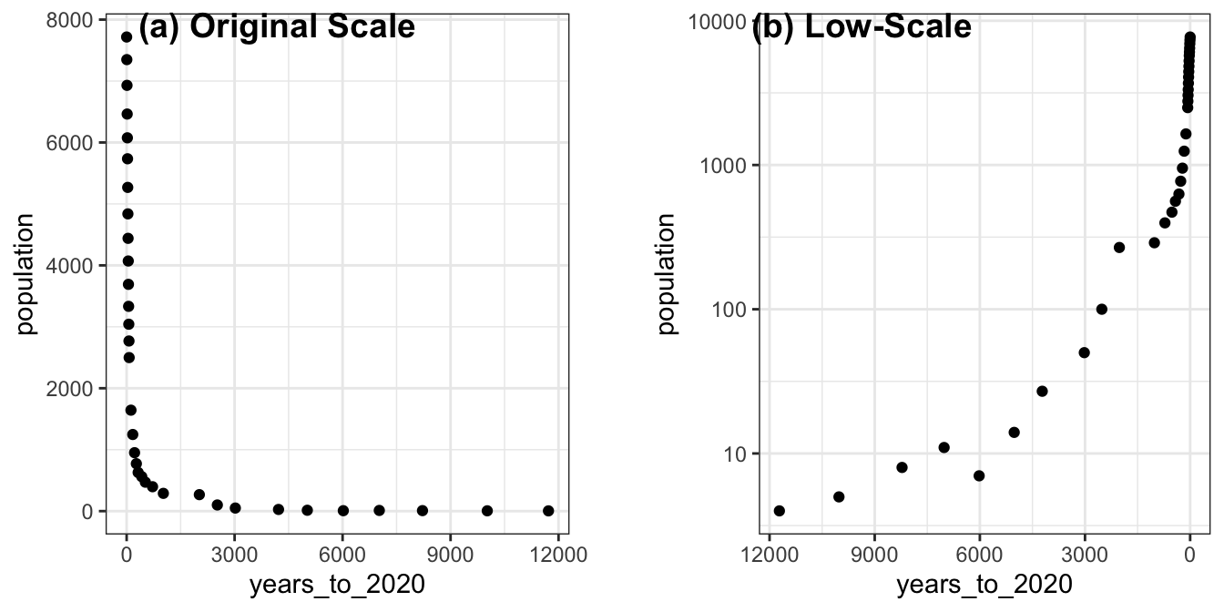
通常情況下,當數據範圍很大,且存在極端值或者偏離值時,使用對數轉換可以更好地展示數據的分佈情況。在這種情況下,你可以使用 scale_x_log10() 或 scale_y_log10() 函數將 x 軸或 y 軸轉換為對數刻度。
例如,如果你有一個數據集,其中一個變量的數值範圍從1到100000,且大多數數據會集中在較小的值上,那麼使用線性刻度將導致數據在圖形中的分佈不平衡,而較大的值會集中在圖形的邊緣或者消失在圖形之外。在這種情況下,使用對數刻度可以更好地展示數據的分佈情況,並且可以更好地顯示較大值之間的差異。而上述資料便有這樣的特色,尤其是在Y軸方向,一開始人口增加量不多,後來指數成長,此時若使用線性尺度,會看不清楚一開始的人口增加量。
##    years_to_2020 population
## 1         11,720          4
## 2         10,020          5
## 3           8220          8
## 4           7020         11
## 5           6020          7
## 6           5020         14
## 7           4220         27
## 8           3020         50
## 9           2520        100
## 10          2020        268
## 11          1020        289
## 12           720        397
## 13           520        471
## 14           420        561
## 15           320        629
## 16           270        772
## 17           220        951
## 18           170       1247
## 19           120       1643
## 20            70       2499
## 21            65       2769
## 22            60       3042
## 23            55       3333
## 24            50       3691
## 25            45       4071
## 26            40       4440
## 27            35       4838
## 28            30       5269
## 29            25       5735
## 30            20       6076
## 31            15       6463
## 32            10       6930
## 33             5       7349
## 34             0       7717
toplot <- population_by_year %>%
mutate(years_to_2020 = map(years_to_2020, ~(str_remove(., ",")))) %>%
mutate(years_to_2020 = as.numeric(years_to_2020),
population = as.numeric(population))
toplot %>% head## years_to_2020 population
## 1 11720 4
## 2 10020 5
## 3 8220 8
## 4 7020 11
## 5 6020 7
## 6 5020 14p1 <- toplot %>%
ggplot() +
aes(x=years_to_2020, y=population) +
geom_point() +
theme_bw()
p2 <- toplot %>%
ggplot() +
aes(x=years_to_2020, y=population) +
geom_point() +
scale_x_log10() + scale_y_log10() +
scale_x_reverse() +
theme_bw()
cowplot::plot_grid(
p1, NULL, p2,
labels = c("(a) Original Scale", "", "(b) Low-Scale"),
nrow = 1, rel_widths = c(1, 0.1, 1)
)
23.2 Order as axis
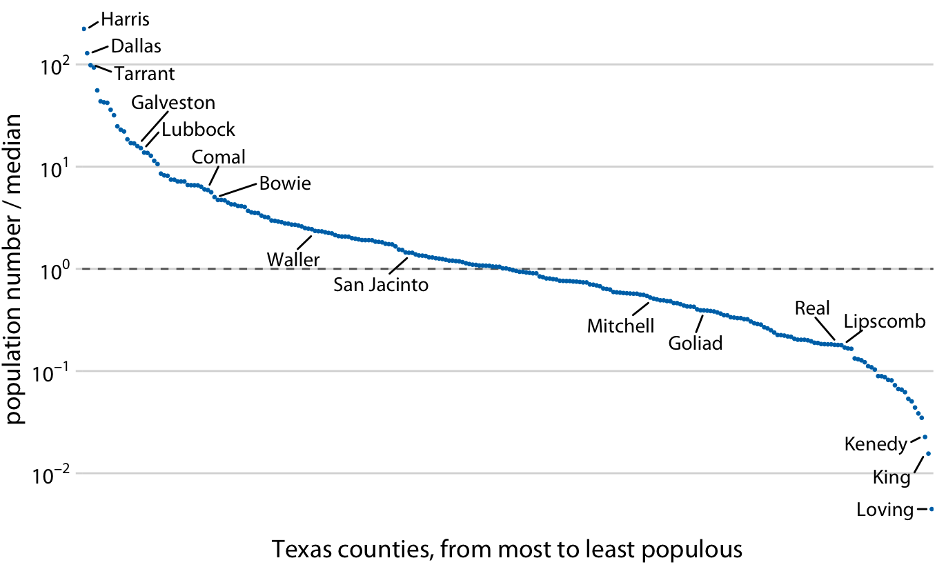
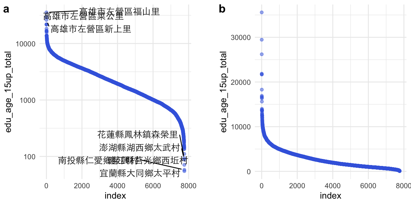
學術論文若要呈現一群數據的分佈時,最常用的是密度(分佈)函數、累積分佈函數,最常視覺化的方法是密度分佈圖(geom_density())或直方圖(geom_histogram())。然而,對新聞等強調「說故事」的文體而言,說故事的技巧往往不是「那一群資源多或資源少的對象」,而經常要直指「那個對象」,要能夠看得見所敘述的對象在圖中的位置。此時,用密度分佈來呈現的話,只能看出,該對象在分佈的某個位置;但可以改用將資料對象根據某個數據來排序後,繪製折現圖的方式來表現。例如,若要繪製一個班級的成績分佈,通常X軸是分數(組),Y軸是獲得該分數(組)的人數;但其實可以將個體依照分數來做排序,Y軸不是某個分數(組)的個數,而是每個排序後的個體,而且以排序後的序號(Ranking)來表示。用折線圖繪製後,一樣可以看出分數的分佈,但卻能夠直接標記敘事中的某個對象是Y軸中得哪個點。
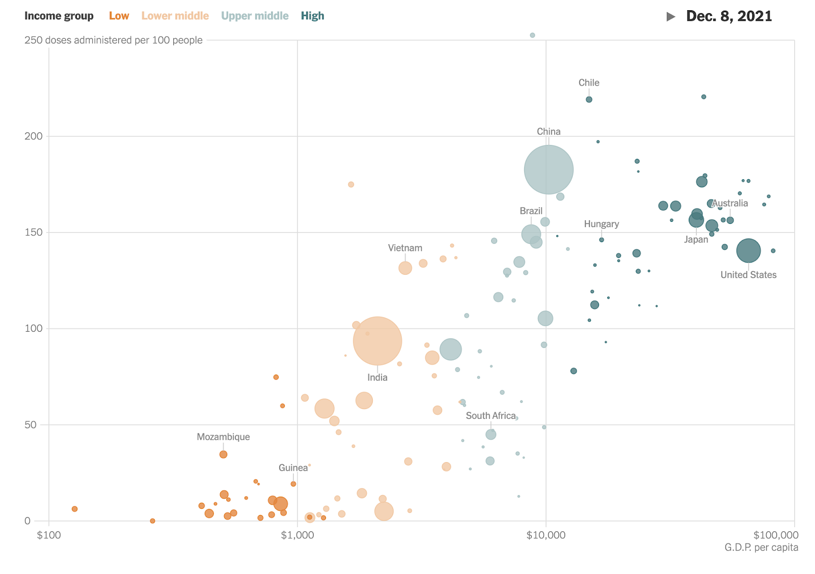
See What’s Going On in This Graph? | Vaccination by Country fromWhat Data Shows About Vaccine Supply and Demand in the Most Vulnerable Places - The New York Times (nytimes.com)
The original chart is animated along the timeline.What Data Shows About Vaccine Supply and Demand in the Most Vulnerable Places - The New York Times (nytimes.com)
23.3 Log-scale
以下我打算繪製出每個村里在15歲以上的人口數,來呈現台灣有些村里人口相當稀少,尤其是花蓮縣、澎湖縣、南投縣和宜蘭縣的幾個聚落。並標記出幾個人口數最高的里。如果我的目的是呈現村里人口數的統計分佈,我會用geom_density()來繪圖(如下),但實際上沒辦法從這樣的密度函式圖來說故事,指出那些人口數過高或過低的村里。
raw <- read_csv("data/opendata107Y020.csv", show_col_types = FALSE)  %>%
    slice(-1) %>%
    type_convert()

raw %>%
  ggplot() + aes(edu_age_15up_total) +
  geom_density()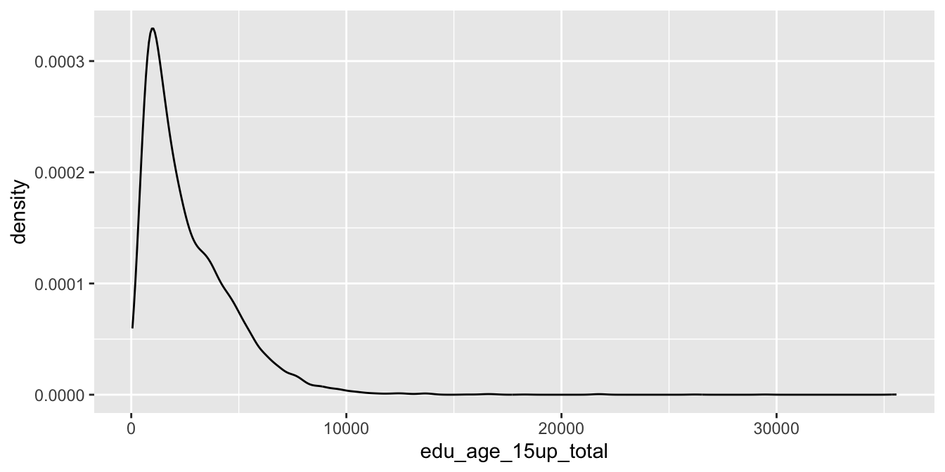
因此,一個比較好的策略是,把各村里的人口數由小到大或由大到小排序好,編好Rank比序的代號,然後讓X軸做為比序,逐一在Y軸打出每一個村里的數據。
但這邊值得注意的是,如果沒有放大尾端(也就是村里人口數最少的那部分),實際上也很難繪圖。所以對Y軸取log,就可以看清楚Y軸的資料點。
toplot <- raw %>%
    select(site_id, village, edu_age_15up_total) %>%
    arrange(desc(edu_age_15up_total)) %>%
    mutate(index = row_number()) %>%
    mutate(label = ifelse(index <= 5 | index > n()-5, paste0(site_id, village), ""))

library(ggrepel)

p2 <- toplot %>% ggplot() + aes(index, edu_age_15up_total) +
    geom_point(alpha=0.5, color="royalblue") +
    geom_text_repel(aes(label = label), point.padding = .4, color = "black",
                  min.segment.length = 0, family = "Heiti TC Light") +
    theme(axis.text.x=element_blank()) +
    scale_y_log10(breaks = c(0, 1, 10, 100, 1000, 10000)) +
    theme_minimal()

p1 <- toplot %>% ggplot() + aes(index, edu_age_15up_total) +
    geom_point(alpha=0.5, color="royalblue") +
    theme(axis.text.x=element_blank()) +
    theme_minimal()

cowplot::plot_grid(
  p2, NULL, p1,
  labels = c("a", "", "b"), nrow = 1, rel_widths = c(1, 0.1, 1)
)
23.4
23.5 Square-root scale
Chap3 Coordination & Axis Fundamentals of Data Visualization (clauswilke.com)
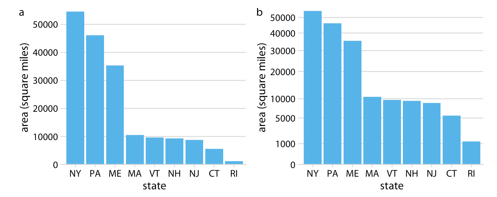
前面是視覺化了各村里大於十五歲以上人口的人口數分佈,採用對數尺度(log-scale)可以觀察到比較小的村里。那有什麼是適合用平方根尺度(sqrt-scale)的呢?是土地嗎?密度嗎?還是人口數?是村里等級嗎?鄉鎮市區等級嗎?還是縣市等級?
town <- read_csv("data/tw_population_opendata110N010.csv") %>%
    slice(-1, -(370:375)) %>%
    type_convert()

town %>%
    arrange(desc(area)) %>%
    mutate(index = row_number()) %>%
    ggplot() + aes(index, area) %>%
    geom_col(fill="skyblue") +
    scale_y_sqrt() +
    theme_minimal()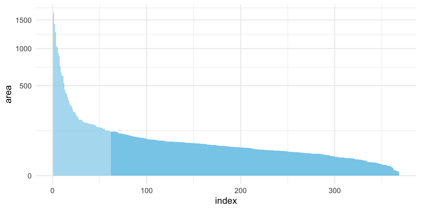
Figure 23.1: (ref:population-area)
county <- town %>%
    mutate(county = str_sub(site_id, 1, 3)) %>%
    group_by(county) %>%
    summarize(
        area = sum(area),
        people_total = sum(people_total)
    ) %>%
    ungroup()

p1 <- county %>%
    arrange(desc(people_total)) %>%
    mutate(index = row_number()) %>%
    ggplot() + aes(index, people_total) %>%
    geom_col(fill="lightgrey") +
    # scale_y_sqrt() +
    theme_minimal()

p2 <- county %>%
    arrange(desc(people_total)) %>%
    mutate(index = row_number()) %>%
    ggplot() + aes(index, people_total) %>%
    geom_col(fill="khaki") +
    scale_y_sqrt(breaks=c(0, 250000, 500000, 1000000, 2000000, 4000000)) +
    theme_minimal()

cowplot::plot_grid(
  p1, p2,
  labels = c("a", "b"),
  nrow = 1
)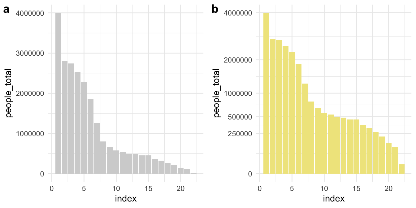
Figure 23.2: (ref:population-area)
23.6 Increasing percentage as Y
23.6.1 NYT: Net Worth by Age Group
LEARNING NOTES
Median for Inequality
這個教學案例來自紐約時報的「What’s going on in this gragh」系列資料視覺化教學之Teach About Inequality With These 28 New York Times Graphs - The New York Times (nytimes.com) 。該圖表呈現在不同年代、不同年齡層的人所擁有的淨資產(包含土地、存款、投資等減去債務)。該圖表的結果指出,在不同年代的老年人是越來越有錢,但年輕人卻越來越窮(該曲線為減去1989年
23.6.2 Read and sort data
Sorted by arrange() function.
p1 <- read_csv("data/interactive_bulletin_charts_agecl_median.csv") %>%
    select(year, Category, Net_Worth) %>%
    group_by(Category) %>%
    arrange(year) %>%
    ungroup()
p1 %>% filter(year <= 1992) %>% knitr::kable()| year | Category | Net_Worth |
|---|---|---|
| 1989 | Less than 35 | 16.17019 |
| 1989 | 35-44 | 112.47530 |
| 1989 | 45-54 | 195.11630 |
| 1989 | 55-64 | 195.25554 |
| 1989 | 65-74 | 154.34277 |
| 1989 | 75 or older | 144.29855 |
| 1992 | Less than 35 | 16.60780 |
| 1992 | 35-44 | 79.91050 |
| 1992 | 45-54 | 139.97745 |
| 1992 | 55-64 | 203.44104 |
| 1992 | 65-74 | 176.44667 |
| 1992 | 75 or older | 155.35173 |
library(gghighlight)
p1 %>% ggplot() + aes(year, Net_Worth, color = Category) +
    geom_line() +
    geom_point() +
    gghighlight(Category %in% c("65-74", "35-44")) +
    theme_minimal() +
    scale_x_continuous(breaks = NULL) +
    theme(panel.background = element_rect(fill = "white",
                                colour = "white",
                                size = 0.5, linetype = "solid"))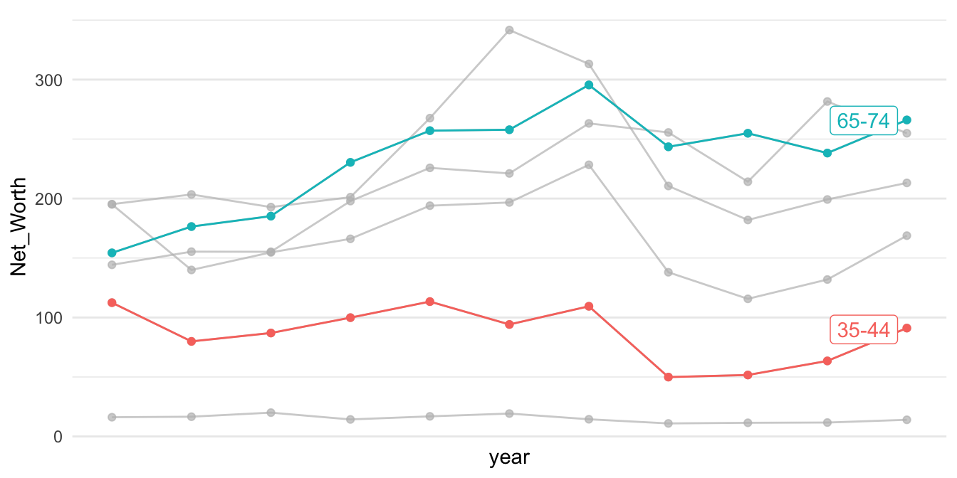
p2 <- read_csv("data/interactive_bulletin_charts_agecl_median.csv") %>%
    select(year, Category, NW = Net_Worth)  %>%
    group_by(Category) %>%
    arrange(year) %>%
    mutate(increase = (NW-first(NW))/first(NW)) %>%
    ungroup()
p2 %>% filter(year <= 1992) %>% knitr::kable()| year | Category | NW | increase |
|---|---|---|---|
| 1989 | Less than 35 | 16.17019 | 0.0000000 |
| 1989 | 35-44 | 112.47530 | 0.0000000 |
| 1989 | 45-54 | 195.11630 | 0.0000000 |
| 1989 | 55-64 | 195.25554 | 0.0000000 |
| 1989 | 65-74 | 154.34277 | 0.0000000 |
| 1989 | 75 or older | 144.29855 | 0.0000000 |
| 1992 | Less than 35 | 16.60780 | 0.0270627 |
| 1992 | 35-44 | 79.91050 | -0.2895285 |
| 1992 | 45-54 | 139.97745 | -0.2825948 |
| 1992 | 55-64 | 203.44104 | 0.0419220 |
| 1992 | 65-74 | 176.44667 | 0.1432131 |
| 1992 | 75 or older | 155.35173 | 0.0765994 |
美國35歲以下的年輕人的中位淨資產比起年長的美國人來說,一開始平均貧窮得多。從「Less than 35」這條線看來,現在的年輕世代比起2004年的年輕世代所擁有的淨資產低了40%。相比之下,65歲以上的美國人現在的淨資產,相較於2004年增加了9%。隨著時代變化,可想像會有一群人的淨資產越來越多,只是現在從這個圖表看來,年輕人所擁有的淨資產相較於過去是越來越低的,多半流入了成年人和老年人手中。
p2 %>% ggplot() + aes(year, increase, color = Category) +
    geom_line() +
    geom_point() +
    gghighlight(Category %in% c("65-74", "Less than 35")) +
    theme_minimal() +
    scale_y_continuous(labels=scales::parse_format()) +
    scale_x_continuous(breaks = NULL) +
    theme(panel.background = element_rect(fill = "white",
                                colour = "white",
                                size = 0.5, linetype = "solid"))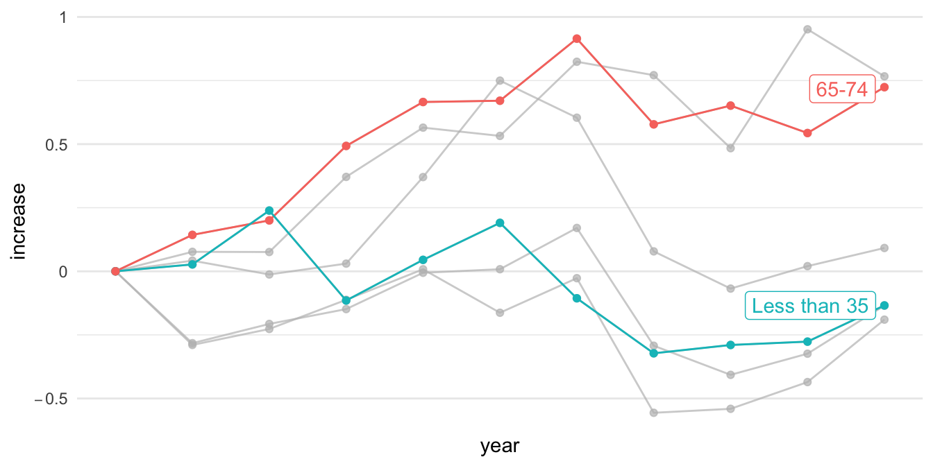
23.7 X/Y aspect ratio
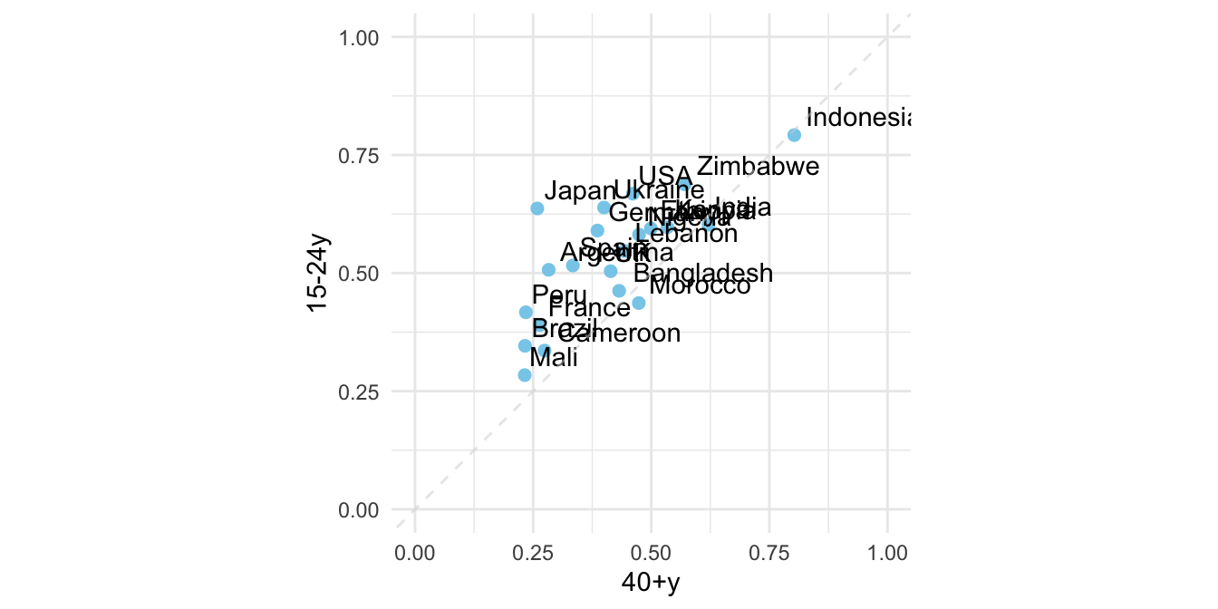
23.7.1 UNICEF-Optimistic (WGOITH)
https://www.nytimes.com/2021/11/17/upshot/global-survey-optimism.html https://changingchildhood.unicef.org/about
plot.opt <- read_csv("data/unicef-changing-childhood-data.csv") %>%
    select(country = WP5, age = WP22140, bw = WP22092) %>%
    mutate(country = ordered(country,
                             levels=c(1, 3, 4, 10, 11, 12,
                                      13, 14, 17, 29, 31,
                                      33, 35, 36, 60, 61,
                                      77, 79, 81, 87, 165),
                             labels=c("USA", "Morocco", "Lebanon",
                                      "Indonesia", "Bangladesh",
                                      "UK", "France", "Germany",
                                      "Spain", "Japan", "India",
                                      "Brazil", "Nigeria", "Kenya",
                                      "Ethiopia", "Mali", "Ukraine",
                                      "Cameroon", "Zimbabwe",
                                      "Argentina", "Peru"))) %>%
    count(country, age, bw) %>%
    group_by(country, age) %>%
    mutate(perc = n/sum(n)) %>%
    ungroup() %>%
    filter(bw == 1) %>%
    select(country, age, perc) %>%
    spread(age, perc) %>%
    rename(`15-24y` = `1`, `40+y` = `2`)

plot.opt %>% head(10) %>% knitr::kable()| country | 15-24y | 40+y |
|---|---|---|
| USA | 0.6679842 | 0.4611465 |
| Morocco | 0.4365079 | 0.4735812 |
| Lebanon | 0.5467197 | 0.4435798 |
| Indonesia | 0.7920605 | 0.8027344 |
| Bangladesh | 0.4624506 | 0.4319527 |
| UK | 0.5040000 | 0.4140000 |
| France | 0.3900000 | 0.2640000 |
| Germany | 0.5900000 | 0.3860000 |
| Spain | 0.5160000 | 0.3340000 |
| Japan | 0.6367265 | 0.2586873 |
plot.opt %>%
    ggplot() + aes(`40+y`, `15-24y`, label = country) +
    geom_point(color = "skyblue", size = 2) +
    xlim(0, 1) + ylim(0,1) +
    geom_text(hjust = -0.1, vjust = -0.5) +
    geom_abline(intercept = 0, slop = 1,
                color="lightgrey", alpha=0.5, linetype="dashed") +
    theme_minimal() +
    theme(aspect.ratio=1)